It only takes around 0.05 seconds for site visitors to decide whether they’ll stay or leave. Statistics show that 94% of the time, these decisions are design-related. If you want to provide clients with valuable information in a quick, concise manner, minimalism is the way to go.
Minimalist websites are fully functional brand platforms that offer viewers an exceptional user experience (UX). They are easy to navigate, always trendy, and convert more clients. Read on to learn how a minimalist website can do wonders for your business.
Minimalism in Websites
Minimalism has been around since the 1900s when German-born American architect Ludwig Mies van der Rohe pioneered modernist architecture. During the 1940s and 1950s, Swiss designs popularized minimalism by using a new print technique.
Today, we see the less is more mindset in different media, even trickling its way into modern websites. We see some of the world’s biggest brands like Toyota, Apple, and Nike apply minimalist elements on their websites.
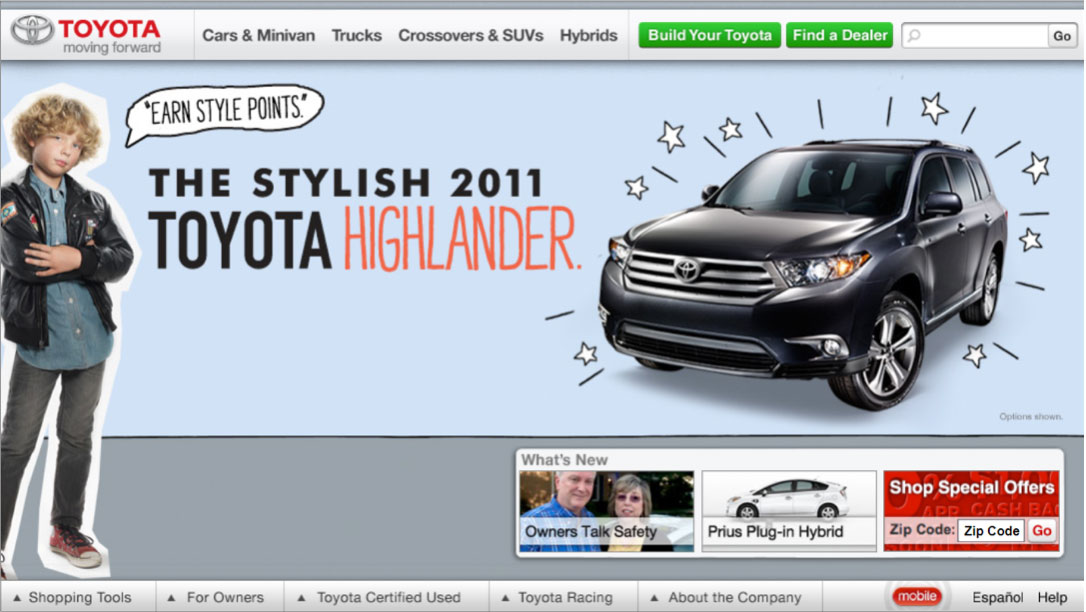
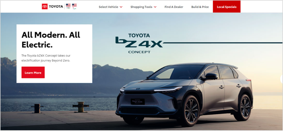
Check out the difference from Toyota’s website from ten years ago to now.
Toyota Website, 2011

Source: Internet Archive
Toyota Website, 2021

Source: Toyota Website
Years ago, websites would have many moving elements in one landing page. Today, websites focus on one message.
Elements of Minimalist Websites
Looking at the Toyota example, we can conclude that minimalist websites don’t go out of style. We recommend companies with limited marketing budgets use minimalist techniques to create timeless sites. The three basic elements of minimalist websites are negative space, visuals, and simple UX.
Negative Space
If you want a minimalist website, don’t be afraid to use negative space. It can be the difference between an overwhelming design to one that attracts potential clients. Using negative space correctly can guide visitors to a particular action.
Google is a megacorporation worth $320 billion, but it chooses to have a minimalist site. It expertly uses negative space to lead visitors to a search bar without unnecessary distractions.

Visuals
Visuals also play a crucial role in minimalist websites. Here are some factors to consider.
- Photography: Minimalist sites don’t have to be boring. We recommend using large, vivid pictures to bring them to life.
- Colors: When creating a minimalist website, it’s best to use a white background to serve as the canvas. We also recommend using neutrals, pastels, and primaries on the white background.
- Typography: We recommend using bold headlines with a smaller, readable body font. When potential customers come across a site for the first time, they want to know its theme right away. A catchy headline can transform a plain site into a minimalist masterpiece.
Simple UX
Running a minimalist website shouldn’t affect a brand’s UX. It should have uncomplicated navigation icons that allow users to go back and forth between pages. Additionally, make sure to have valuable sections for your call to action, such as requesting quotes or buying products.
Revamp Your Website Today
In a study, a whopping 88% of people claim they are not likely to engage with a website again after a negative experience. Creating a functional minimalist site will help you minimize such instances.
If you want professional brand strategists, designers, and developers to build one for you, visit Xicay Technologies today. It’s the first step toward digital marketing success.
